Feedback
Badge
A short status or category marker.
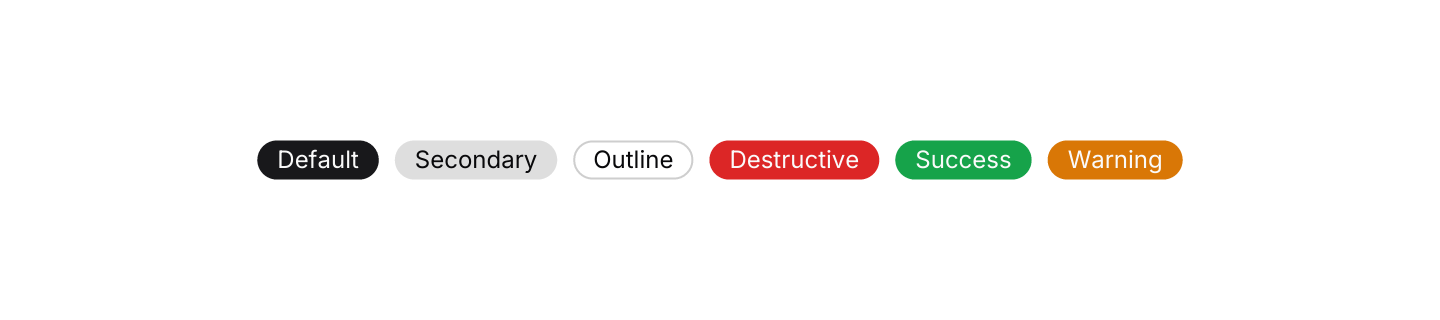
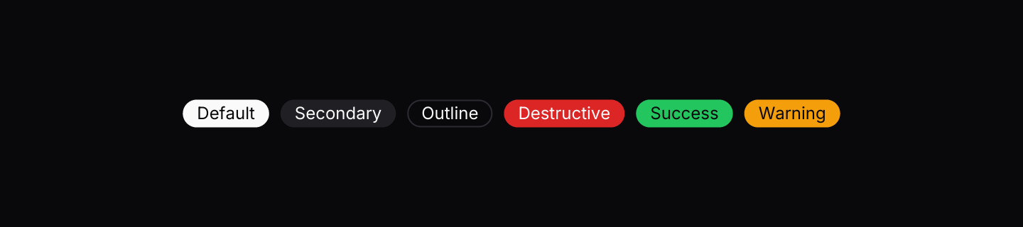
Static preview
use iced::widget::row;
use iced::{Alignment, Element};
use iced_cube::badge;
use iced_cube::feedback::badge::Variant;
#[derive(Debug, Clone)]
pub enum Message {}
#[derive(Debug, Default)]
pub struct Example;
impl Example {
pub fn update(&mut self, _message: Message) {}
pub fn view(&self) -> Element<'_, Message> {
row(Variant::ALL.map(|variant| badge(format!("{variant:?}")).variant(variant).into()))
.spacing(8)
.align_y(Alignment::Center)
.wrap()
.into()
}
}Usage
Badges are for short labels that sit next to other content: a status in a table row, a tag on a card, a version number. Keep the text to a word or two.
Success, Warning and Destructive map to the theme’s status colours, so use them only when the badge actually reports a state. For neutral tags, Secondary and Outline stay out of the way.
Badges are not interactive. If a label needs to respond to clicks, use a button instead.
Examples
With icon
A small Lucide icon before the label.
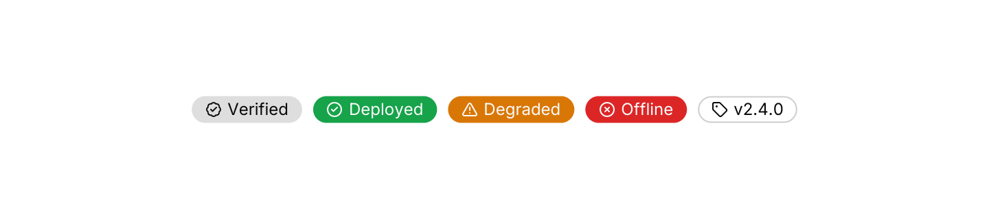

Static preview
use iced::widget::row;
use iced::{Alignment, Element};
use iced_cube::feedback::badge::Variant;
use iced_cube::{badge, lucide};

#[derive(Debug, Clone)]
pub enum Message {}

#[derive(Debug, Default)]
pub struct Example;

impl Example {
    pub fn update(&mut self, _message: Message) {}

    pub fn view(&self) -> Element<'_, Message> {
        row![
            badge("Verified")
                .icon(lucide!(BadgeCheck))
                .variant(Variant::Secondary),
            badge("Deployed")
                .icon(lucide!(CircleCheck))
                .variant(Variant::Success),
            badge("Degraded")
                .icon(lucide!(TriangleAlert))
                .variant(Variant::Warning),
            badge("Offline")
                .icon(lucide!(CircleX))
                .variant(Variant::Destructive),
            badge("v2.4.0").icon(lucide!(Tag)).variant(Variant::Outline),
        ]
        .spacing(8)
        .align_y(Alignment::Center)
        .wrap()
        .into()
    }
}In a list
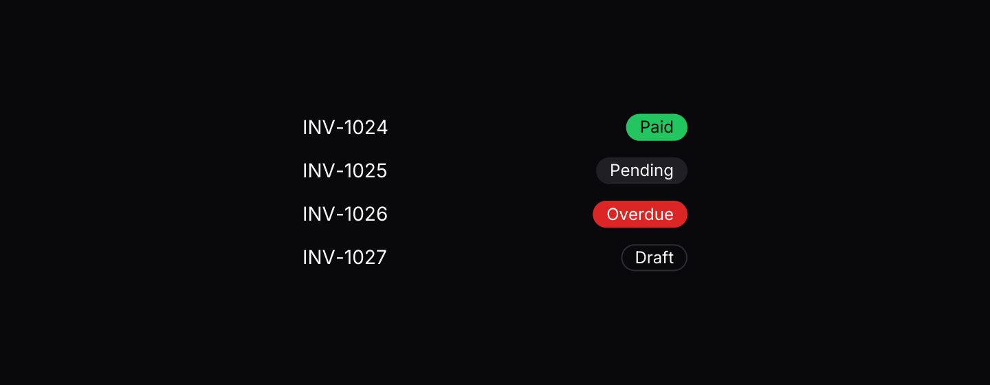
Status badges aligned against list rows.
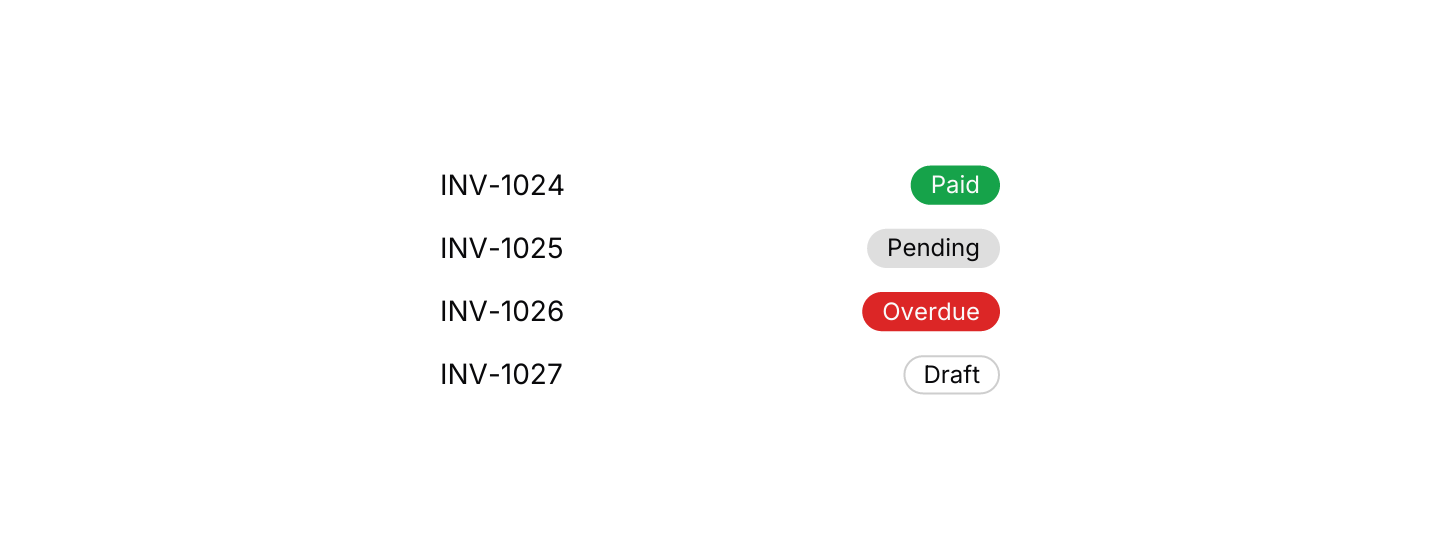
Static preview
use iced::widget::{column, row, space, text};
use iced::{Alignment, Element};
use iced_cube::badge;
use iced_cube::feedback::badge::Variant;

#[derive(Debug, Clone)]
pub enum Message {}

#[derive(Debug, Default)]
pub struct Example;

const INVOICES: [(&str, &str, Variant); 4] = [
    ("INV-1024", "Paid", Variant::Success),
    ("INV-1025", "Pending", Variant::Secondary),
    ("INV-1026", "Overdue", Variant::Destructive),
    ("INV-1027", "Draft", Variant::Outline),
];

impl Example {
    pub fn update(&mut self, _message: Message) {}

    pub fn view(&self) -> Element<'_, Message> {
        column(INVOICES.map(|(number, status, variant)| {
            row![
                text(number).size(14),
                space::horizontal(),
                badge(status).variant(variant),
            ]
            .align_y(Alignment::Center)
            .into()
        }))
        .spacing(12)
        .width(280)
        .into()
    }
}API
| Item | Description |
|---|---|
badge(label) | Creates a pill-shaped badge with a text label. |
.variant(Variant) | Default, Secondary, Outline, Destructive, Success or Warning. Defaults to Default. |
.icon(glyph) | Adds a small Lucide icon before the label. |