Layout
Separator
A thin line that divides related groups of content, with optional inline text.
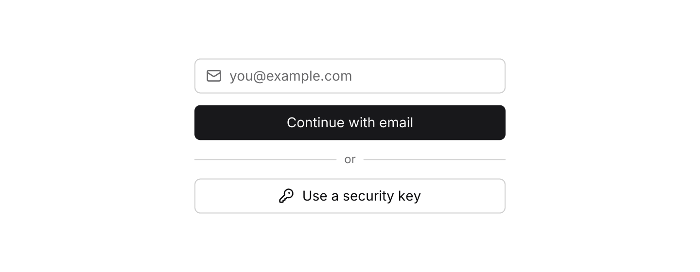

Static preview
use iced::widget::column;
use iced::{Element, Length};
use iced_cube::primitives::button::Variant;
use iced_cube::{button, input, lucide, separator};

#[derive(Debug, Clone)]
pub enum Message {
    EmailChanged(String),
    Continue,
    UseKey,
}

#[derive(Debug, Default)]
pub struct Example {
    email: String,
}

impl Example {
    pub fn update(&mut self, message: Message) {
        if let Message::EmailChanged(email) = message {
            self.email = email;
        }
    }

    pub fn view(&self) -> Element<'_, Message> {
        column![
            input("you@example.com", &self.email)
                .icon(lucide!(Mail))
                .on_input(Message::EmailChanged),
            button("Continue with email")
                .width(Length::Fill)
                .on_press(Message::Continue),
            separator().label("or"),
            button("Use a security key")
                .icon(lucide!(KeyRound))
                .variant(Variant::Outline)
                .width(Length::Fill)
                .on_press(Message::UseKey),
        ]
        .spacing(12)
        .width(Length::Fixed(320.0))
        .into()
    }
}Usage
Separators are one pixel wide and take their colour from the theme’s border token. Space around them comes from the parent’s spacing.
A vertical separator fills the height of its row, so give the row a height (or let taller siblings set it) when the separator sits between short items such as links.
Examples
Horizontal and vertical
A horizontal rule between sections and vertical rules between links.
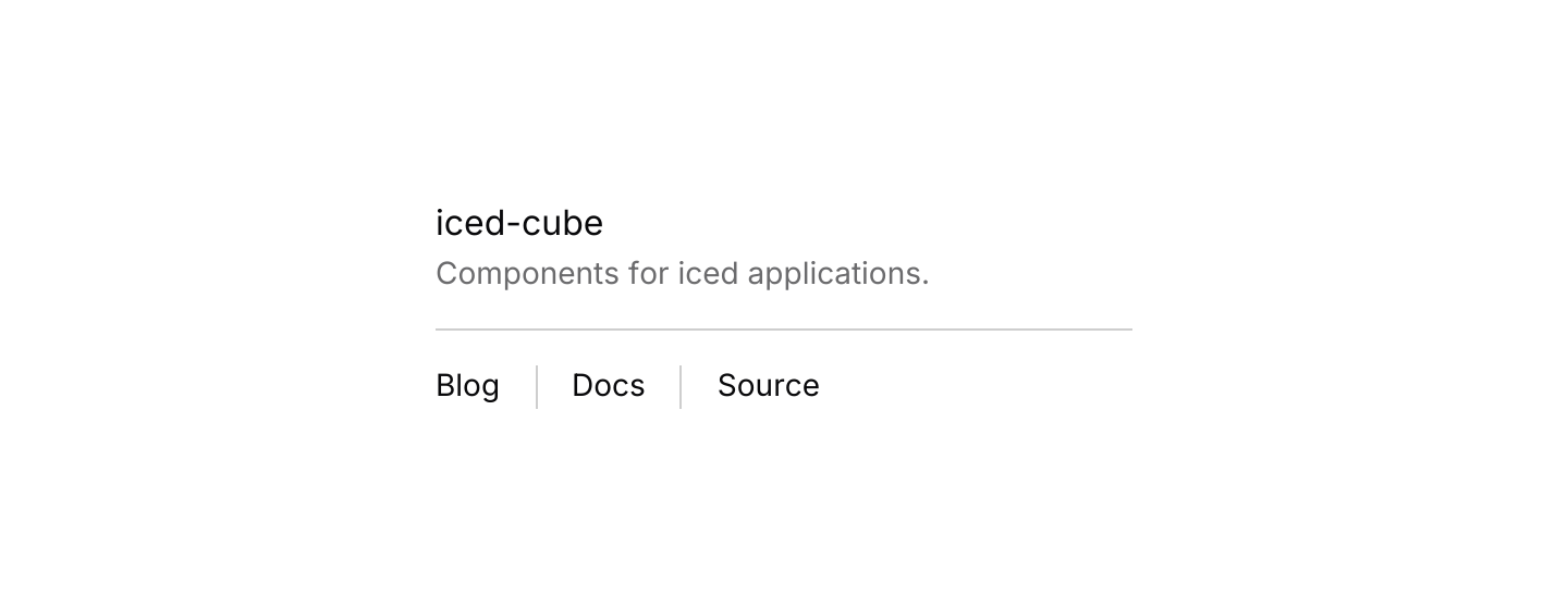

Static preview
use iced::widget::{column, row, text};
use iced::{Element, Length};
use iced_cube::theme::{Tokens, text_size};
use iced_cube::{separator, vertical_separator};

#[derive(Debug, Clone)]
pub enum Message {}

#[derive(Debug, Default)]
pub struct Example;

impl Example {
    pub fn update(&mut self, _message: Message) {}

    pub fn view(&self) -> Element<'_, Message> {
        let muted = |theme: &iced::Theme| text::Style {
            color: Some(Tokens::of(theme).muted_foreground),
        };

        column![
            column![
                text("iced-cube").size(text_size::MD),
                text("Components for iced applications.")
                    .size(text_size::SM)
                    .style(muted),
            ]
            .spacing(4),
            separator(),
            row![
                text("Blog").size(text_size::SM),
                vertical_separator(),
                text("Docs").size(text_size::SM),
                vertical_separator(),
                text("Source").size(text_size::SM),
            ]
            .spacing(16)
            .height(20),
        ]
        .spacing(16)
        .width(Length::Fixed(320.0))
        .into()
    }
}API
| Item | Description |
|---|---|
separator() | Creates a horizontal line that fills the available width. |
vertical_separator() | Creates a vertical line that fills the available height. |
.orientation(Orientation) | Horizontal or Vertical. Defaults to Horizontal. |
.label(text) | Shows short muted text, such as "or", in the middle of the line. |